 the spreadsheet appreciator has logged on
as of when i'm writing this, it's summertime where i live, and far too hot to be comfortable in lolita. when i can't wear my clothes, i still want to engage with fashion, and often find myself dreaming up outfits or playing with data and archival. i have a running spreadsheet where i keep track of my wardrobe, including a few data factors like theme and release year. most of my interests are aesthetic and vibe based, so naturally the color and theme are very important to me when picking a lolita piece.
periodically, i like to export graphs so i can see some kind of overview of my collection. i decided to share a few of those graphs here, and explain why.
update 07 sep 2024: i just did a fairly major re-shuffle of my wardrobe after acquiring my #1 dream dress and selling quite a few other pieces. here are updated spreadsheets, although the overall stats and explanation remain roughly the same.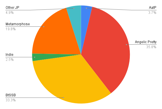


main pieces by brand
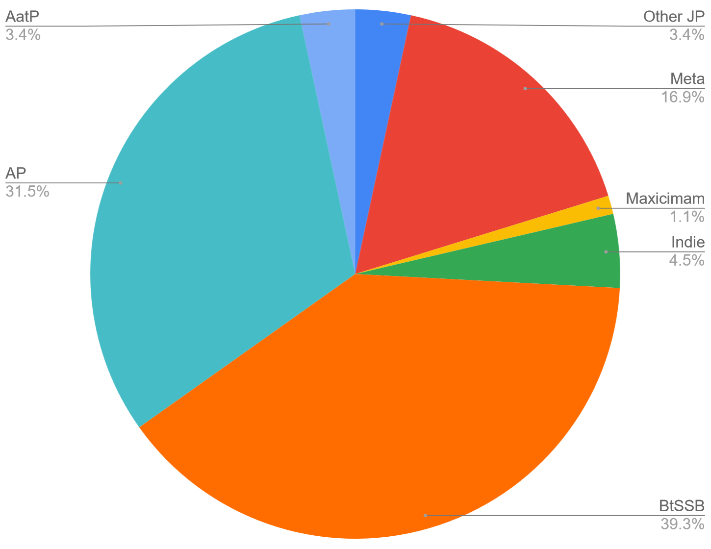
as a mostly sweet lolita, of course the majority of my wardrobe is baby the stars shine bright and angelic pretty. i first discovered lolita fashion in the early 2000s through volks super dollfie's collab with baby. no surprise that it's now the most common brand in my wardrobe :) tied for my favorite brand with baby, is angelic pretty.
the "indie" tag includes my pieces from smaller scale designers from around the world. i have a couple pieces from wire head (lithuania), an op from unicorn tears (china), and a jsk from gloomth (canada). "other JP" covers some japanese brands from which i only have a few pieces-- my one shirley temple skirt, and two pieces from innocent world.
the "indie" tag includes my pieces from smaller scale designers from around the world. i have a couple pieces from wire head (lithuania), an op from unicorn tears (china), and a jsk from gloomth (canada). "other JP" covers some japanese brands from which i only have a few pieces-- my one shirley temple skirt, and two pieces from innocent world.

main pieces by year
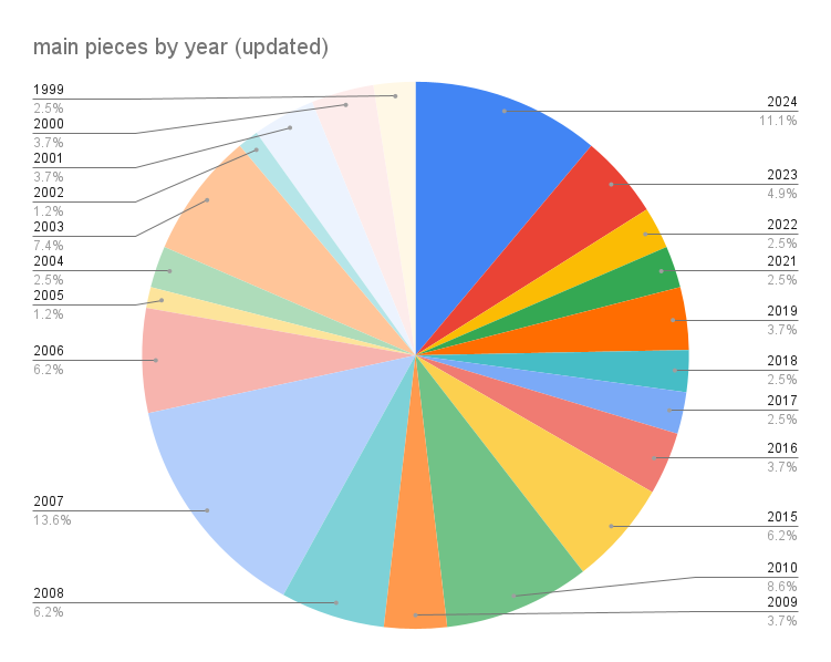
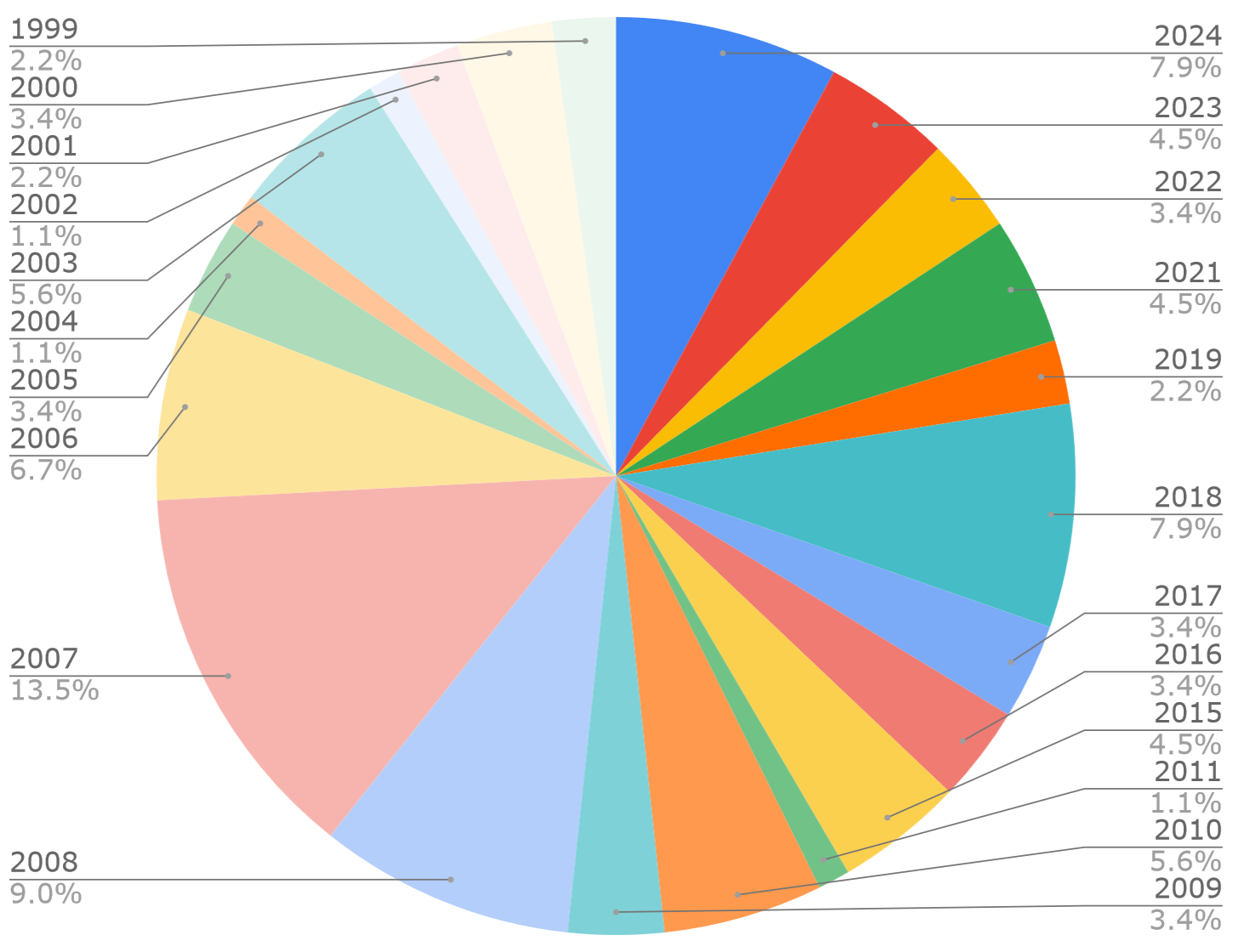
the numbers here are pretty straightforward, i strongly prefer old school lolita looks. i started wearing lolita in late 2006, and i find that i gravitate to pieces i liked back then, but couldn't afford as a broke college student. a lot of my post-2020 pieces are from btssb's classics collection, reissues of their earlier designs in new colorways.
i used to have a lot more of early 2010s AP candy sweet type prints, but i have come to realize that i love that look on other people, but not so much on me. you can also tell by the numbers here that i absolutely do not care for the early-mid 2010's swassic craze. i tend to go for more simple graphical prints, and less of the OTT rococo type styles. my entry point into lolita (early 2000's btssb) has always informed my taste in pieces at least a little, even when it comes to which modern pieces i go for. i also love ap's late 2010's chiffon print era, especially when it comes to the ocean themed prints they did around that time. dream marine and jewel marine are two of my absolute favorites.
i used to have a lot more of early 2010s AP candy sweet type prints, but i have come to realize that i love that look on other people, but not so much on me. you can also tell by the numbers here that i absolutely do not care for the early-mid 2010's swassic craze. i tend to go for more simple graphical prints, and less of the OTT rococo type styles. my entry point into lolita (early 2000's btssb) has always informed my taste in pieces at least a little, even when it comes to which modern pieces i go for. i also love ap's late 2010's chiffon print era, especially when it comes to the ocean themed prints they did around that time. dream marine and jewel marine are two of my absolute favorites.

main pieces by color
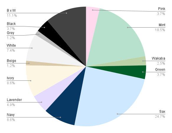
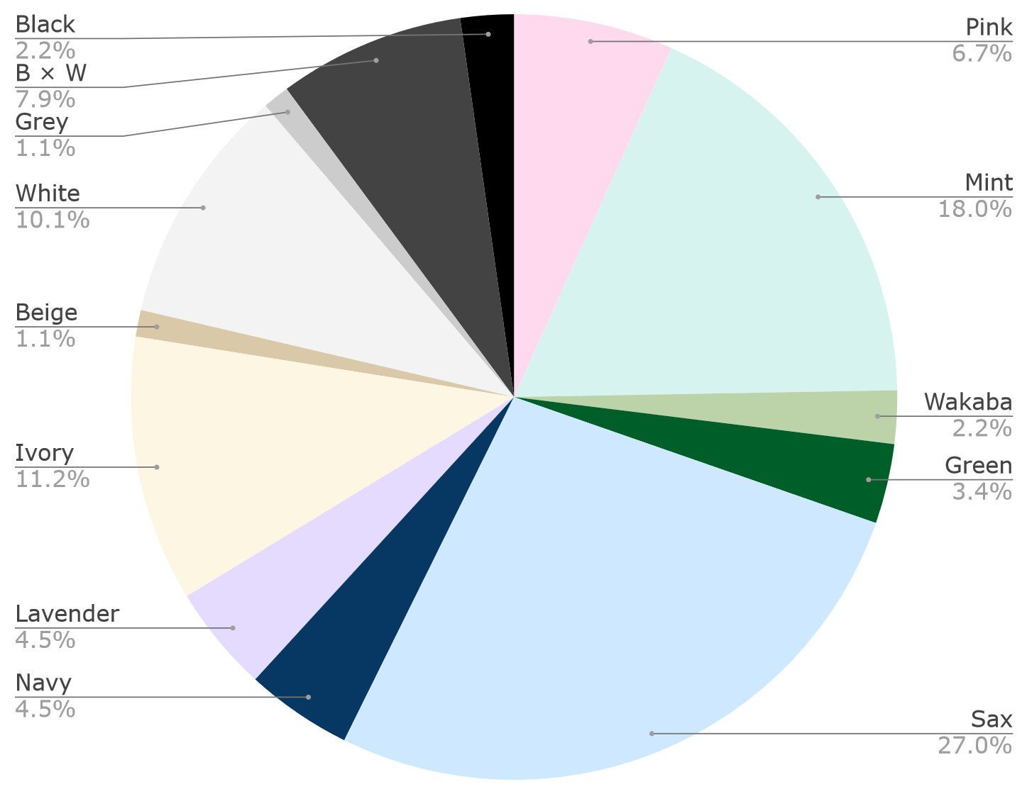
if it's not obvious by my web design, my wardrobe, and basically everything else about my visual presence, i strongly prefer cool colors. i have a few pink and lavenders for variety, and ivory/kinari is another fave! being an old schooler is a bit difficult when i dislike the color red, and don't have a particularly strong preference for pink. in fact, i would wear more pink, but the warmer/salmony shades look pretty gross with my skinfone. that leaves lots of sax and neutral tones.
i use "wakaba" (young/fresh leaves) for shades of green that are neither mint nor darker green. btssb uses that term for their midtone green, and i am very fond of the mental image it invokes. i also just love this color a lot, it's a bit rare in lolita and makes for some unique coords.
i adore the aqua-blue shade of mint that angelic pretty often uses. i actually took a fairly long and thorough hiatus from lolita fashion in the late 2010s, and AP's emerald dream misty sky was the exact release that pulled me back in. i like their pale, desaturated sax, but my absolute favorite color they use is a bit more saturated one that i'd describe as "blue coconut cream" or "ramune blue." the sax jewel marine and dream marine are the perfect examples of this color. at some point, i will likely make a spotlight page on some of my favorite uses of color in lolita.

main pieces by material or print theme
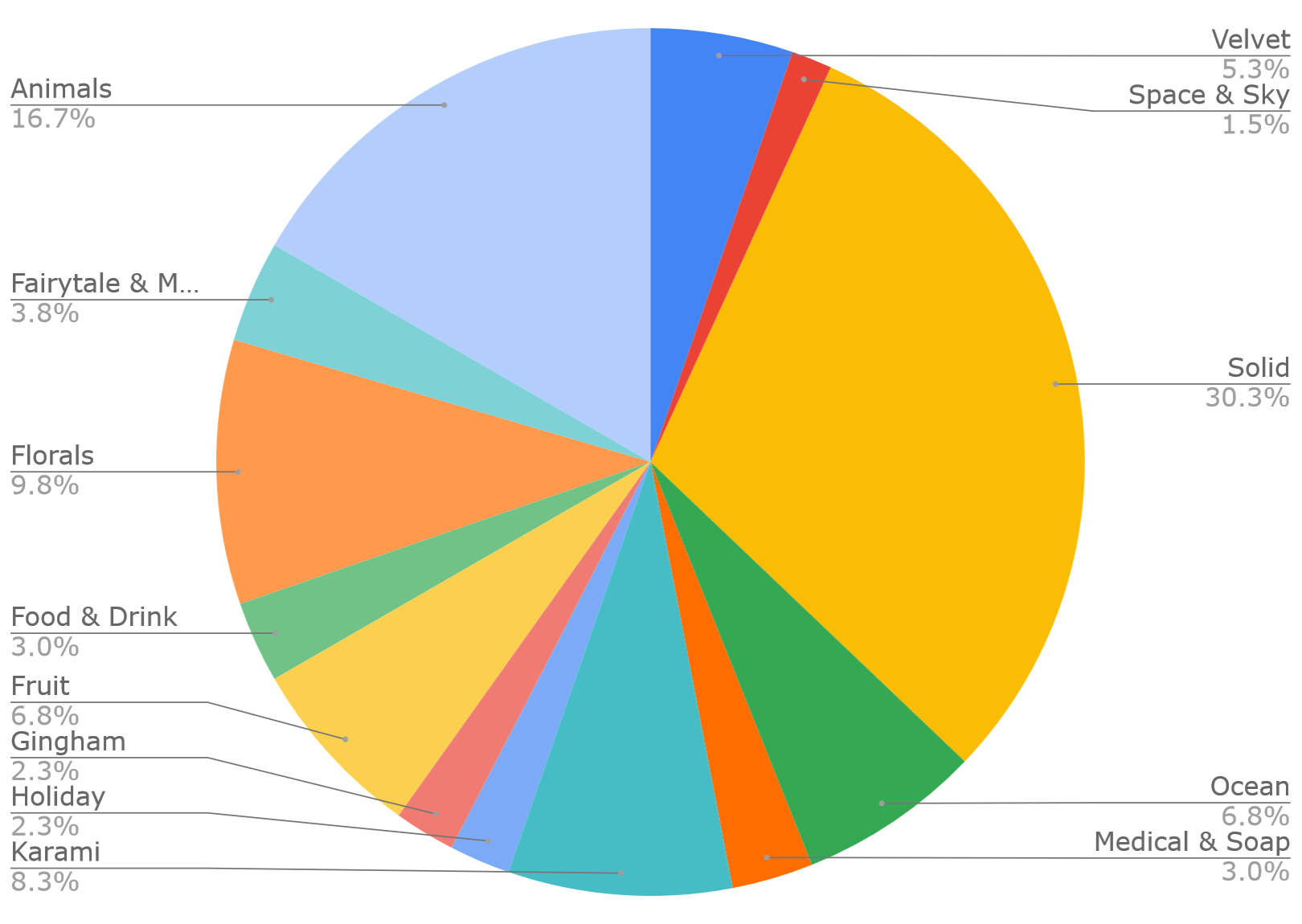
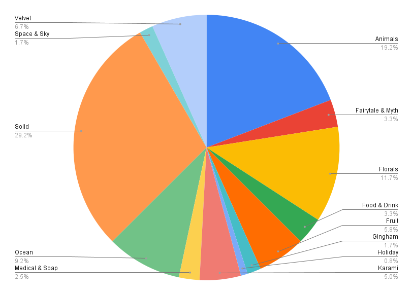
my spreadsheet includes two columns for tags on themes on each garment. for example, a piece could have both fruit and floral (such as btssb's sugar bouquet), or velvet and solid, and so on.
i love animals a lot, so of course that's my most common theme for prints. there's also a fair amount of crossover with the "ocean" tag as well, because i especially love sea creatures :) i hope someday a lolita brand will give me the seal print of my dreams, haha. i have ap's lovely snow fantasy, and it always feel like it's missing a little baby seal among the other white winter creatures.
i have a fondness for florals, but i don't necessarily own a lot because i prefer to collect florals with any species of flowers other than roses. angelic pretty really got me good this spring/summer when they released flower kitten (tulips, pansies, nemophila), then followed it up with suzuran bouquet shortly after.
i use "fairytale & myth" to tag any kind of folk story print, including western religious/chrisitan themes. garments under this tag include aatp's scheherezade print and the koitsukihime stained angel pieces; i don't actually care for many of the more straightforward fairytale themes such as cinderella. similarly, "holiday" is every holiday-- christmas, halloween, easter etc. i like seasonal prints, but also try not to own too many of them when they aren't super practical outside of their respective holiday season.
for solids, i have a lot of the commonly used burberry from btssb and older ap. however, i really love light cotton karami, both for wearability and look. it's so light and comfortable, and the weave patterns fascinate me. i also have a soft spot for old school velvet pieces, despite (for now) living in a climate where i really can't wear them. i first really took notice of metamorphose as a brand when they released a collection of deep green/navy velvet pieces in winter 2008.
